
Life is about using the whole box of crayons….RuPaul

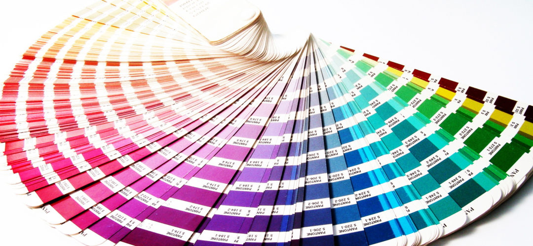
I thought we would start with the 2020 “Color of the Year.” According to Pantone(Color Institute), it is Classic Blue #19-4052. The Pantone Color System is the Queen of universal color matching. Originated in 1963 to help solve the complicated color matching problems in the printing industry. And as they say – “The rest is history!” Pantone has become the easiest and simplest way to classify, communicate, and match colors throughout the world for the design industry, paint, textile, and plastics. Pantone is the universal language of color today.
Pantone selects a main color for the year along with several tones for the upcoming seasons palette
Who decides what color palette will captivate us for a year? Well, it’s not one person hanging out with a color wheel. Color is a prominent part of pretty much every industry. The selection is an international effort with multiple teams, multiple companies, and top trend trackers. The color industry is led by: The Color Marketing Group (CMG) which leads the industry in determining the palette trend. CMG conducts meetings around the world with color experts and trendsetters from a vast variety of industries and countries.
What fascinates me is the meme aspect that circulates around a color palette from one industry to another, before a specific color or colors are determined. It’s not surprising to learn that color trends start with fashion. The color direction does not evolve from one fashion | runway show. But, instead evolves over a couple of seasons. The color of the year might start out, a year or two earlier as a tag-along accent color,(that demands attention). Or perhaps it’s a touch of blue in a denim jacket with a sequined top.
By the time the color hits the pedestal of – drum roll – The Color of the Year, it has been totally dissected. It has grabbed attention and been noted in a number of couture shows, and catwalks. Editorial notes from fashion and interior publications have taken noticed. Related design industries, marketers, and trend trackers have picked up on it, as well. Eventually making its debut to the public as the color of the year. And moves into a wide range of designs and price point.
- Color is being influenced by environmentally responsible and sustainable design, emphasizing the natural color.
- Color theory is becoming more important, with trends focusing on how and why different color hues are used versus single colors.

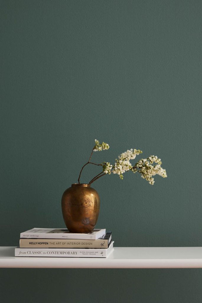
2020 began a new decade that places an importance on biophilia – our intrinsic need as humans to interact with nature. For the home, the inclusion of live greenery, hemp/linen, cotton and mineral-based materials like marble allows the creation of a natural sanctuary that encourages rejuvenation in our everyday life. It’s about being more mindful of our surroundings. To appreciate the beauty in nature and how to bring it indoors.
The evolution of fashion | catwalk color palettes and trends merging into home interiors has been ongoing since the mid-1970s. The 80s and 90s saw the mass introduction of more fashion-forward colors into the home. Which in turn fueled the advance of a new segment of the Home Furnishings industry: Decorative Home Accents. For the color shy this offered the opportunity to experiment with color without a long-term commitment. This color movement also propelled new confidence and a wider selection of designs for the armchair decorator and her home. Around this same time was the expansion of worldwide marketing, trend tracking, and color consulting for both fashion and interiors.
Although Pantone leads with authority in color forecasting. Other industries, specifically, paint brands carry out their own detective work that may or may not be the same as Pantone. But, will work within and or compliment the color range and palette of Pantone, CMG, and other color trend setters. Here are a few companies and their 2020 selections.
Color : Color : Color
PPG Paint Company headquartered in Pittsburgh, PA is singing the blues. And christened their color Chinese Porcelain, an exotic blend of navy and cobalt blue. Dee Schlotter: Color Specialist with the company related that blue kept rising to the top choice in numerous color meetings. Schlotter goes onto say “When you look at a highly anxious, highly contentious world right now, people feel very unsettled, unmoored almost. Blue is a trustworthy, anchoring color. It’s the color of the sea and the sky. It’s reassuring.”

Sherwin-Williams called all hands on deck for the launch of Naval, it’s color of the year 2020. This is a bluesy ode to the luxe, Great Gatsby style of the Twenties. Sue Wadden, Dir. of Color Marketing for Sherwin-Williams says: “Blue was prevailing through all the palettes and all of the themes we were talking about.” She goes on about “the optimism and overreaching themes of wellness and nature; all of which contributed to the company’s selection.” She continues that “we could have a four-hour conversation about the power of navy.”
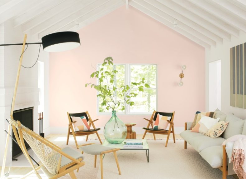
Benjamin Moore selected First Light as it’s color of the year. It’s a soft, rosy pink with pale grey undertones. And, I have to say this hint of pink looks so sophisticated with all of our band of blues above, especially with Pantone’s Classic Navy. Hannah Yeo: Color Marketing + Development Mgr. says “2020 is the dawn of a new decade and what’s more appropriate than the color of First Light!” Pink has been sneaking around us for the last few years. When you take it out of the baby’s room you find an amazing amount of urban hip to the color. Especially when paired with a masculine color like Navy or Thunder Gray. On a personal note: I’m a push-over for pink and grey. Both of which reside nicely in my living room.
Behr is hiking back to nature with Earthy Greenery for 2020. Erika Woelfel, VP of Color and Creative Services at Behr explained at the color of the year event in Napa, California. “We look at green as being nature’s favorite color. It takes us to a place that feels effortless, like a hike in the woods, or a walk on the beach. It’s a color that signifies life and mortality.” Green has such a varied range of tones. It can take you from a deep jeweled emerald to the natural beauty of seagrass. The mix of these yellow-green tones for 2020 blend perfectly with the California wine country terrain for this Santa Ana CA. based company.

The Next Generation
One of the things I adore about having a blog is the research that goes into a post. And the incredible people and companies that I come across. Clare and its’ founder is one of these treasures. Nicole Gibbons (profile below) launched the Clare brand, a direct to the customer paint company, a few years ago. She and her team spent years researching paint formulas and the consumers’ experience purchasing paint. Not a happy dance experience for most consumers. The Clare website makes every step fun. Take the quiz. Immerse yourself in the colors. You’ll come away wanting to paint every room in your home.
“When it comes to paint colors at Clare, we believe in timeless over trendy. We think people will always prefer more timeless neutrals. But when it comes to colors that have been unexpectedly popular, we’re definitely seeing a trend toward rich, moody hues. Current Mood is the number two most-visited color on our website and gets a ton of love on Instagram. It’s also a top-five best-selling color, and outside of this rich green shade, we’re seeing more of an interest in deeper, moodier colors.” —Nicole Gibbons of Clare

The brains behind it all
Meet Nicole Gibbons, our founder and an interior designer who saw that no paint brands were offering an easy or convenient way to shop for paint, so she decided to fix that. A true expert in her field, her design know-how has been featured by top media outlets like HGTV, The Oprah Winfrey Network, Good Morning America, Elle Decor, and more. Nicole is passionate about helping people create beautiful spaces they love. And with Clare, she’s continuing to do just that…one perfect paint color at a time!
Color! What a deep mysterious language, the language of dreams…..Paul Gauguin
Behind all these exceptional colors and “I want to live there” photos, is the science. A blended formula of color theory. Mathematics. The psychology of color. Trends. Branding. Marketing. And running alongside the science is the sensory perception that blends together to ensure that a number of trends will maintain the test of time and evolve into a standard of design.
A few standards are: Monochromatic, which continues to give a sense of order and calm. Traditional anchors us in time. A deep burnt orange makes us feel warm. Blue offers a range of emotions. From sadness to calm and reassuring. Wool projects softness, and other raw materials connect us to living things. Ultimately, that which continues to dictate and surpass all fashion and interior trends is the beauty of the natural world that we live in.
I’m going to go along with David Hockney “I prefer living in color!” Another industry and aspect of color we did not explore is our personal colors. Which colors enhance all the best qualities we personally possess. You might want to pop over to another fabulous blog …Une femme d’un certain age, Susan Blakey has great style and a wonderfully informative fashion | lifestyle blog. She had her colors analyzed last year in London. It truly makes a difference. You’ll find all the info you need with Susan.
Do you live in color? Please send a couple of snaps of your “colorful life”….

.
/
12 Comments
LAURIE
August 17, 2020 at 4:58 pm…very interesting!
kate granado
August 18, 2020 at 11:51 amYou have always been very good at working color into your life! xok
Sue Estenson
August 17, 2020 at 1:08 pmVery informative article today Kate! I could talk color all day long. Currently I am wearing my favorite shoes which are bright yellow!
kate granado
August 18, 2020 at 11:53 amI thought of you when writing this and knowing your taste for color. Yellow shoes – you go girl. xok
Leslie Martel
August 17, 2020 at 1:04 pmLast summer I re-did our ocean front apt. ….kitchen countertops in a gorgeous blue…looks like water; backspash in blue glass tiles, bathroom in blue glass and blue porcelain floors and painted everything pale lemon yellow…..and furniture is a variety of blues…..love love love it all!! I like colorful clothing, food and cocktails!!!
kate granado
August 18, 2020 at 11:38 amI always cook by color! And dress for the event – in color!! So happy you liked the post. I can just imagine with your artist palette and talent your home looks amazing. And how nice to have that big blue patch of ocean just outside your window!! xok
Patti
August 17, 2020 at 12:16 pmI like the color of the year. When I looked in my closet I saw lots of blue…especially navy.
kate granado
August 18, 2020 at 11:40 amYes, you do wear a lot of blue, and it looks great on you. Navy is right there alongside – black, white and grey – thats my color palette. xok
Elaine
August 17, 2020 at 9:58 amLook at your closet it tells all
kate granado
August 18, 2020 at 11:44 amdon’t stand too close to your living rooms walls – we’ll loose sight of you! You’ll blend in so perfectly! xok
Elaine Haydon
August 17, 2020 at 8:30 amI like the blue, you can keep the green.
🙂
kate granado
August 18, 2020 at 11:45 amBlue is your color, for sure…xok